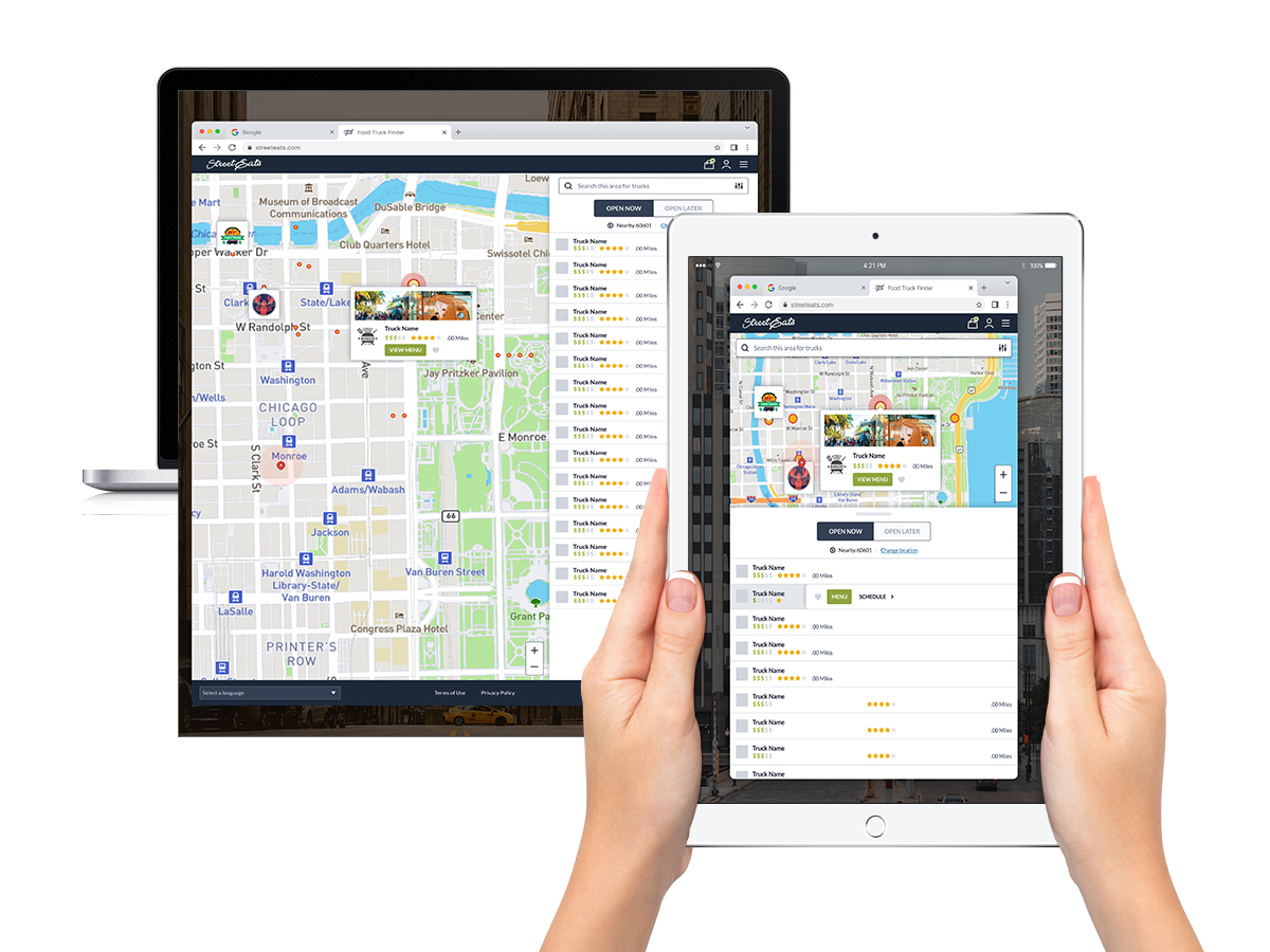
Project
The food truck craze is growing, and with it, the need for a more efficient and user-friendly way to find food trucks. This project aims to create a food truck locator that will make it easier for customers to find the trucks they want, and for employees to manage their businesses (not displayed here). The locator will use a combination of popular app/social elements, such as user ratings, GPS location tracking, and directions to the truck's location. It will also offer a pre-pay option, which will allow customers to avoid long lines.
In my preliminary research, I found that many existing food truck locators are poorly designed and difficult to use. They often lack important information about the trucks, such as their menus and hours of operation. The pre-pay option is also not widely available. This project aims to address these issues by creating a locator that is easy to use, informative, and efficient.
In addition to its practical benefits, the food truck locator will also serve as a personal education/growth tool for me. I will be able to learn about new practices, trends, and methodologies in the app and responsive product industry. This will help me to stay current in my field and to develop my skills as an aspiring product designer. I am excited to work on this project. I believe that the food truck locator has the potential to make a real difference in the way people find and enjoy food trucks.
- Project: Food Truck Locator Product (Responsive)
- Date: October 2016 - March 2017 (Updated 2023)
- Roles: UI/UX Design, Research,
- Programs Used: Figma, Photoshop, Illustrator
- Deliverables: Branding, Wireframe, Personas, Design System, Prototype, Responsive Product (Mobile First)
Research
The food truck locator product is a personal development project that I created after having poor personal experience, and realizing that the process could be vastly improved. How do you speed up the wait (long wait of 20-30 minutes)? Make sure customer is getting the correct order?
Although I was overall satisfied with my experience at the time, I was seeing gaps in the process that would allow for more speed, accuracy, and efficent for both patrons and the truck employees. The main complaint was, why can't there be a pre-pay option in the app, similar to a recent feature Starbucks added, or along lines of Panera's popular rapid pickup.
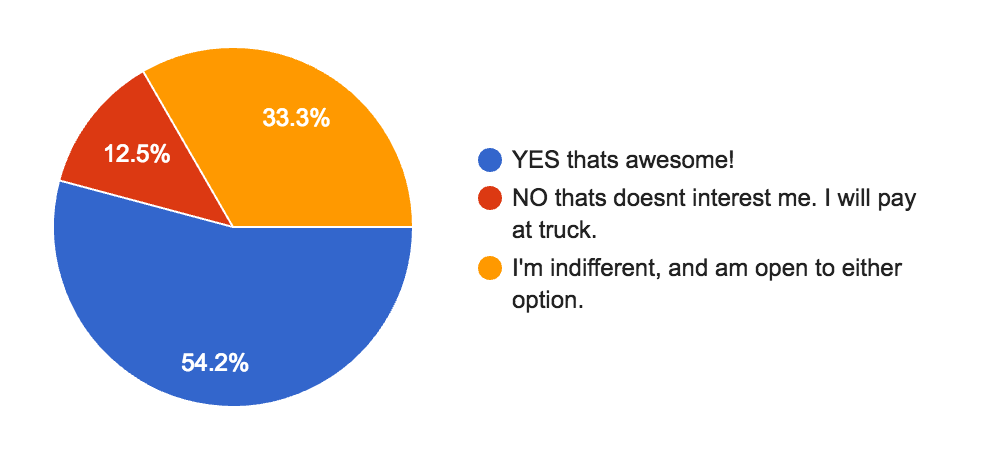
Aside from my order, I did also observe other customers who had orders overlooked. What could be done to make the food truck process as seemless and smooth as possible. Would customers prefer to order thru a website or app?... pay before arrival?... present reciept at pick up and be on their way? Could it ease line frustration and order clarity? One potential concern, would be a potential limited availability of goods with too many pre-orders. If everyone orders thru the app would there be enough food left for the people just waiting in line and not prepaying?
Competitor Analysis
Starting to get the discussion and research started, I began some in depth analysis of the features and capabilites at several competitors to locate areas for improvement. Below is synopsis of some of the findings.
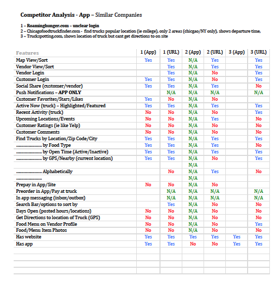
Upon diving into some of the competitor features and what they offer, the realization came that this app could fill a missing nitch in the food truck app spectrum.
The main driving feature of this app would be the in app pre-pay to ease frustration, speed up the process, and ease confusion. Throughout my research it appears no one has really thought this could be an advantage, either in app or on site.
Another thing that seemed to be lacking with in the apps are the availability of any sort of a food menu. Most food trucks provide a very limited on site menu to keep things simple and avoid a ton of extra supplies needed. Why can't trucks have a menu of the items they have available to prepare right there within the app, on a personal truck page, to make it easier on the customers? Even if the user doesn't prefer to pre-pay or order in the app, one would think have the menu on hand would help users from having to hunt down a menu else where. Obviously this would have to be generated and entered by the specific food truck vendor. As a consumer, I personally prefer to research the options of a truck or restaurant that I might be heading over to dine at.
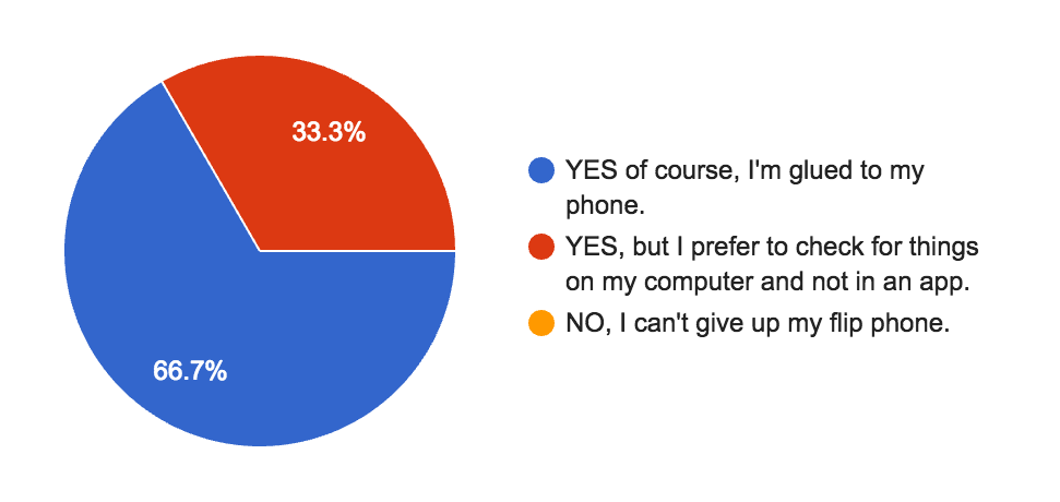
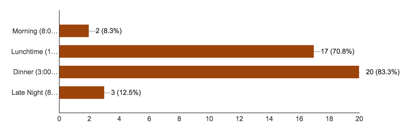
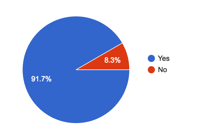
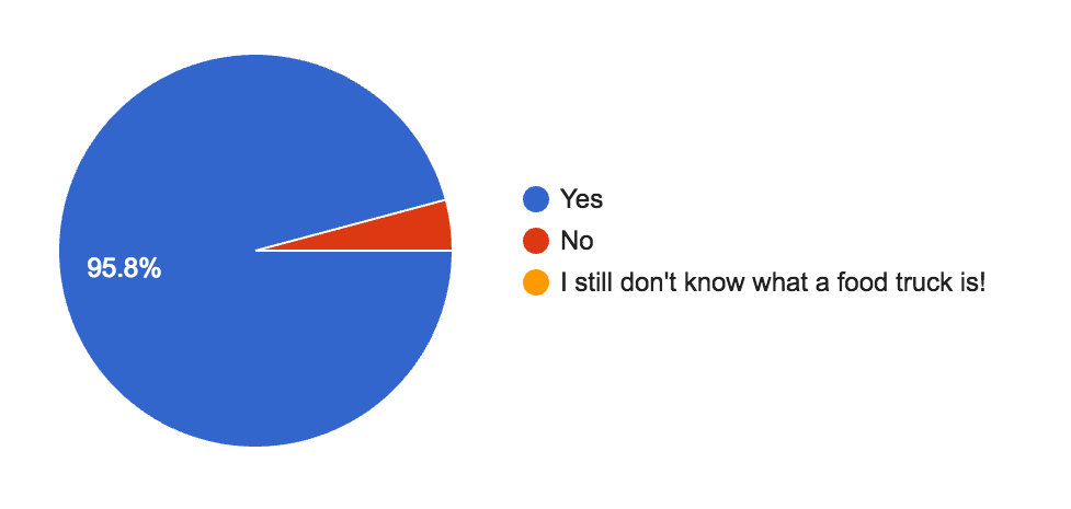
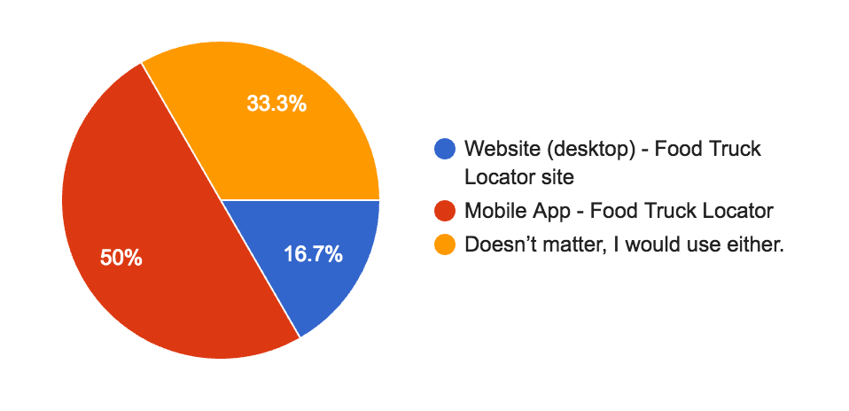
Survey Questions and Results
A total of 24 participants were asked to complete a survey and answer some general questions, about who they are, what are their social habits, their eating habits, and any previous experience with a food truck.
The top 10 question and their results are featured below.
Personas
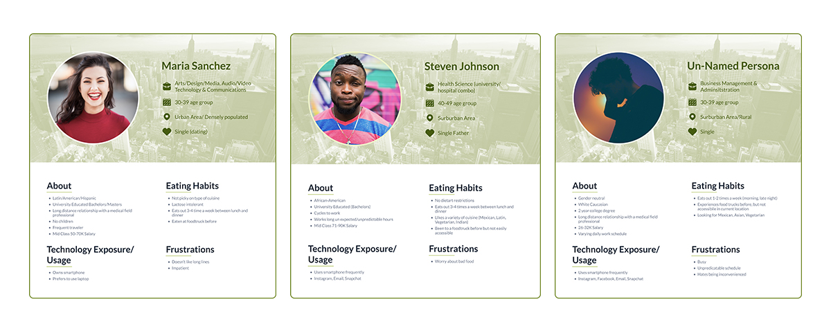
Based on the data gathered from the results of the survey, I was able to compile several user personas that could give a glimpse into the potential product demographic. It also helps provide insight into potential preferences and choices a user may make.
Upon completion of the research, some new conclusions were made about some things that were either over looked, or additional approaches that could have been made. One survey question that was overlooked, was not asking users what type of phones they use (Apple, Android, etc). Based on findings, I think this makes sense as a mobile repsonsive site versus an app. A chunk of the users preferred using their laptop computer more. Once an order is placed, a reciept could be emailed or thru sms for ease of access (especially for those preferring a traditional device). User could them display reciept on mobile phone for pickup. One other resources for user input outside of the survey would have been the actually ask food truck visitors on site. Due to this project being started in the off season of foodtrucks, that process was not focused on; It however would be a great supporting tool to the survey.
Flowchart, Wireframes, Paper Prototype, Design System
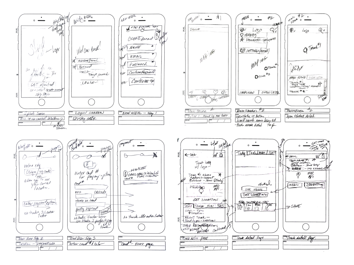
Moving on from the research portion, I began using some of my findings to begin sketching out the general flowchart, to start to begin to make some sort of visual sense of this app. First of all below, are some rough pencil wireframes to get the thought process moving.
Once the general direction was worked out, and thought process was in motion.
It soon moved onto taking the rough rendering from pencil to Sketch and start composing the wireframes for the product. Before proceeding the more hi fidelity final screens, I conducted a user analysis with paper prototypes on several peers to gather some information/considerations that I may have missed.
-
Wireframes Sketches -

Wireframes Sketches -
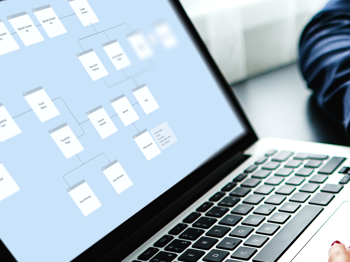
Flowchart -
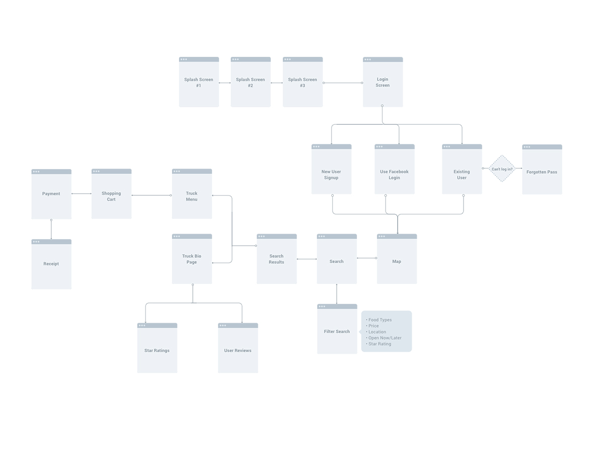
Flow Chart -
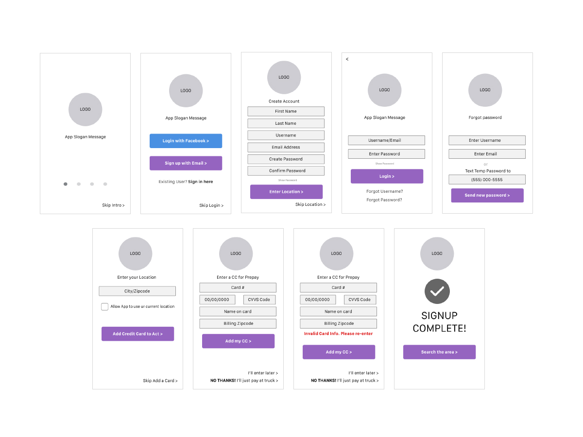
Sketch Wireframes -
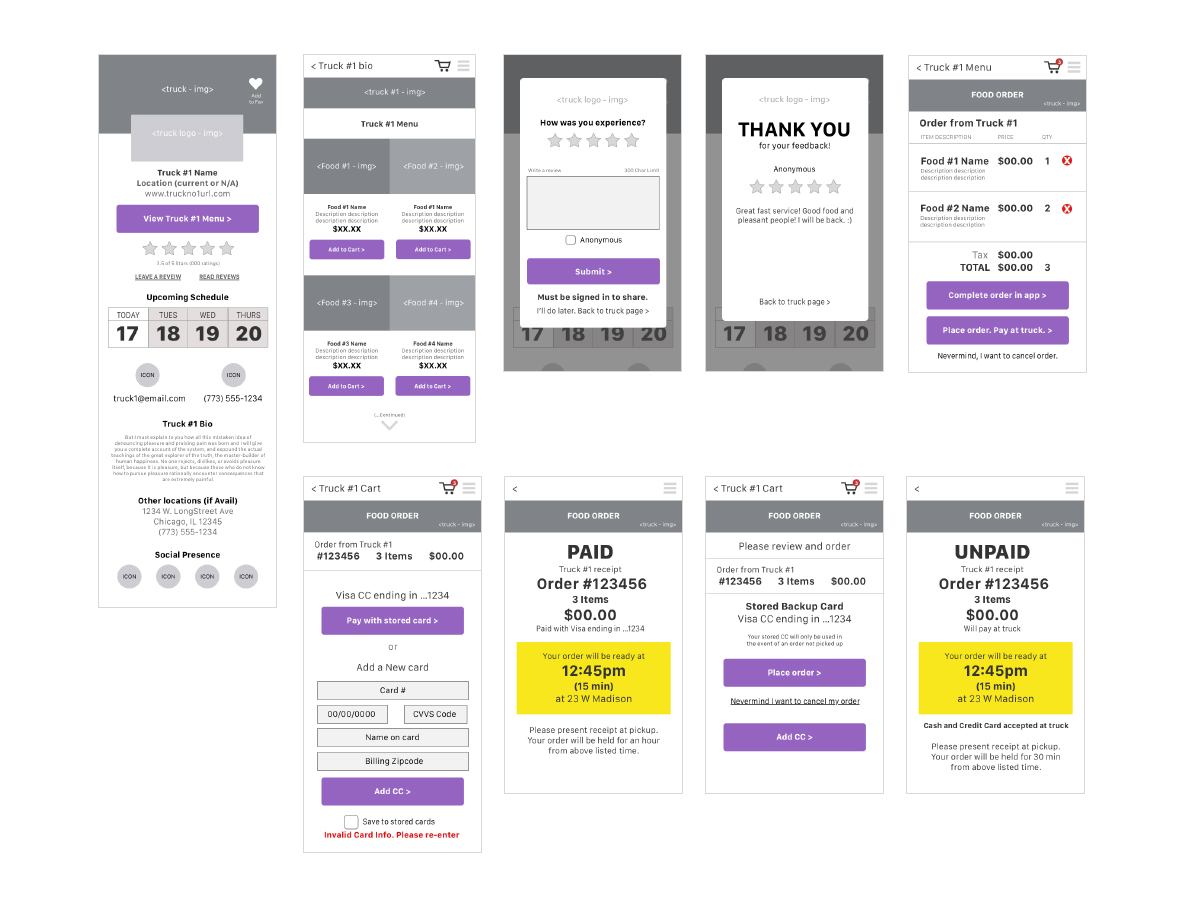
Sketch Wireframes -
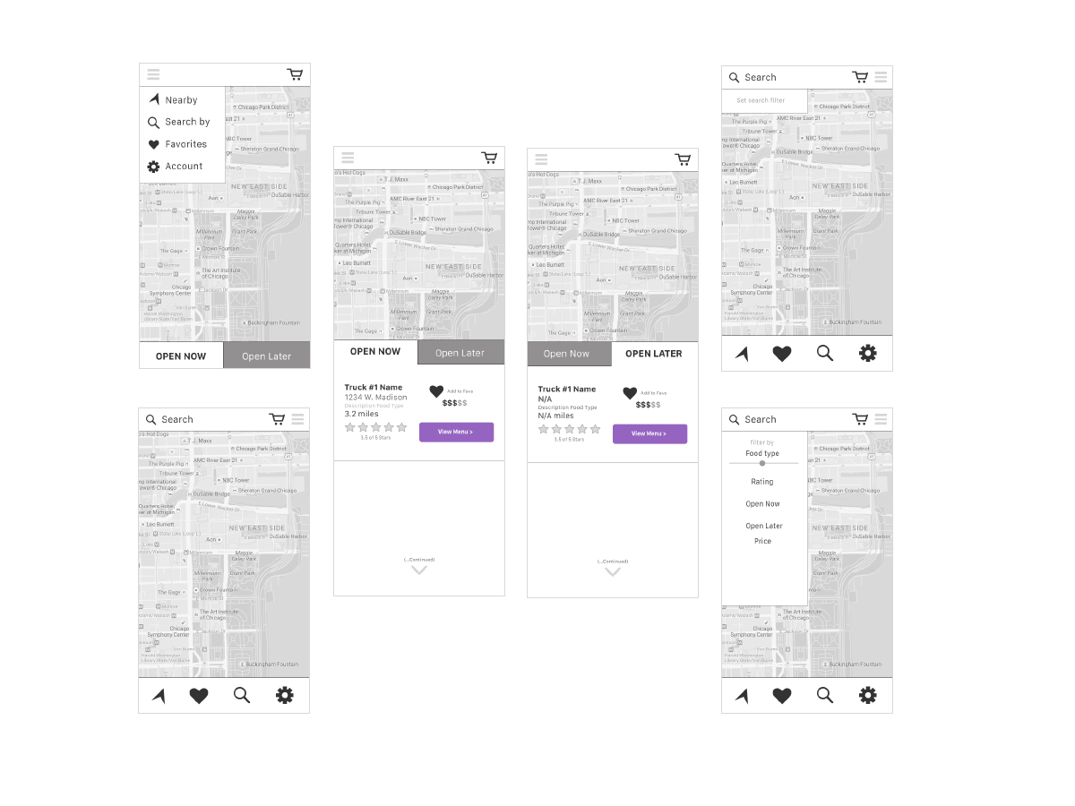
Sketch Wireframes -
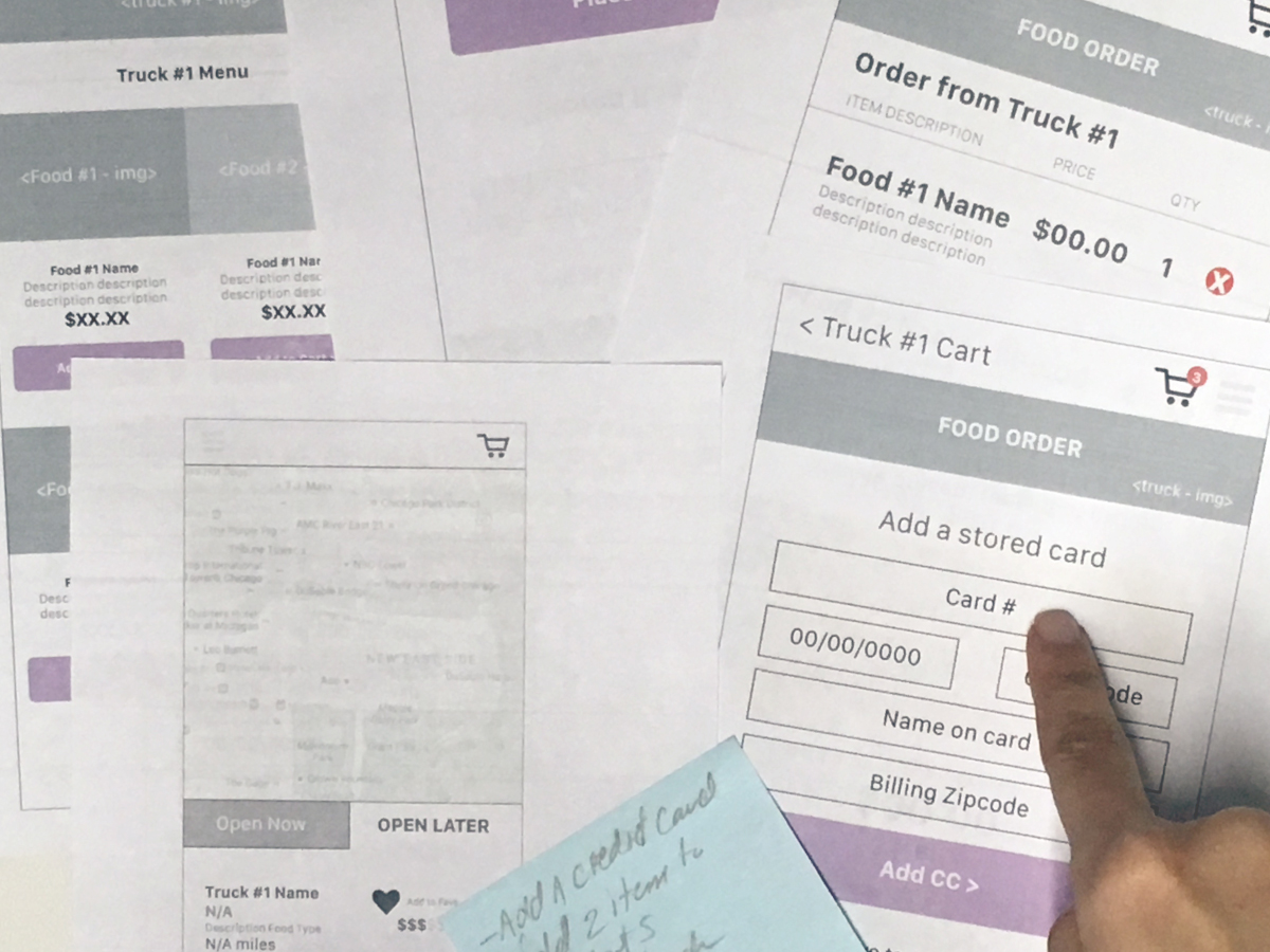
Paper Prototype (Usability Test)
-
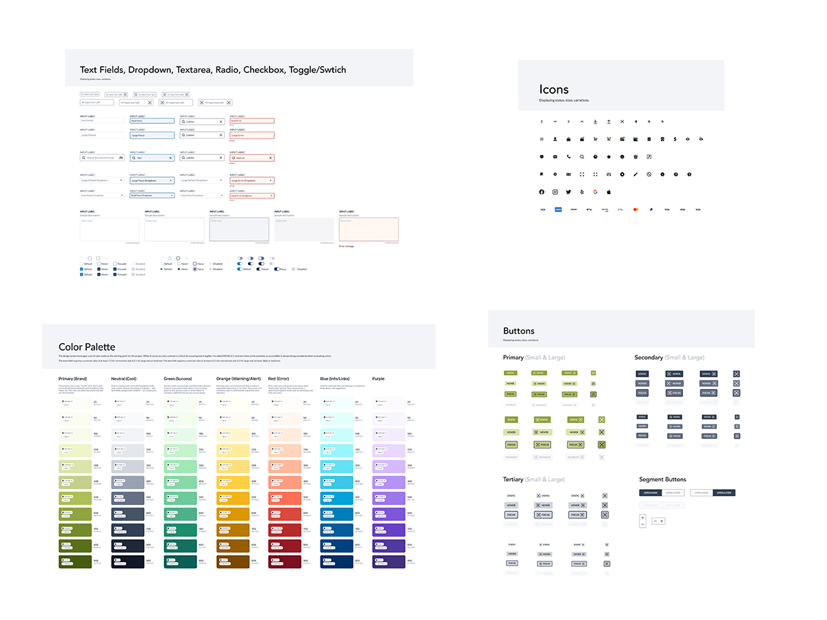
Design System -

Design System
Final Screens
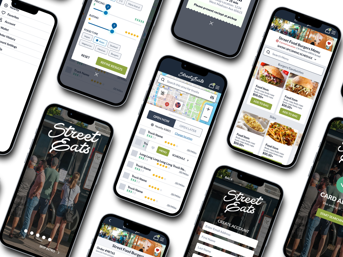
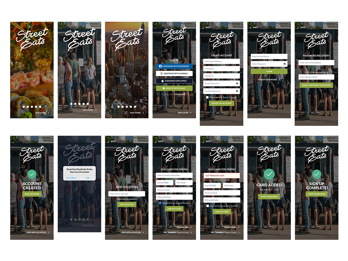
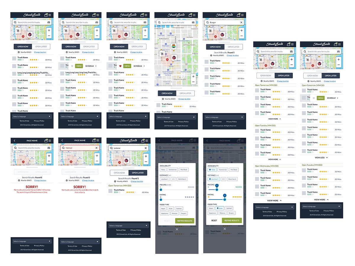
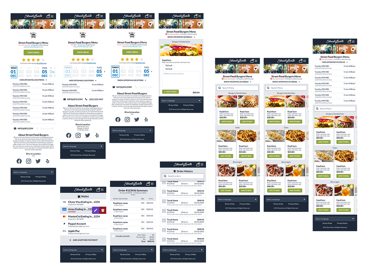
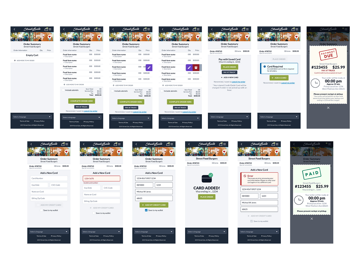
The majority of the final design of the screens and interaction used within this product are shown below. Most of the screens here show the mobile version of the product. However I have included what a potential desktop and tablet view may consist of.
Visuals for what would be the final phase of the product with all of the primary screens, that showing different section of the product. It covers login capabilities, payment options, order placing, account information, past purchase, as well as multiple ways to be able to search for a nearby food truck
Synopsis
I am very pleased with the results of this project. I learned a great deal, and I am confident that I can use this knowledge to create even better products in the future.
One of the most important things I learned was the importance of user research. I conducted a survey, but I realized that it missed a few key points. I would have benefited from conducting in-person interviews with people who frequent food trucks. This would have given me a better understanding of their needs and wants.
I also learned the importance of iterating on my designs. I started with a basic idea, but I continued to refine it as I learned more about my users. This process of iteration led to a better product.
Finally, I learned the importance of perseverance. This project was not without its challenges, but I never gave up. I kept working and iterating until I was satisfied with the results.
I am grateful for the opportunity to have learned so much from this experience. I am confident that I can use what I have learned to create even better products in the future.
Some of my key takeaways from this experience are the importance of conducting user research, iterating on my designs, getting feedback from users, and perseverance.
I am excited to continue learning and growing as a product designer. I am confident that I can create products that elevate customer experience.

